
Restaurant menu management concept

Problem Statement
Restaurant menu management is like art. Having a proper way to manage menus can save and earn lot more things. Mainly what they want is for owners and managers should be able to simply manage their menus. They should be able to manage snacks, beverages, and other items.
Timeline 📆
Day 1
Research about domain knowledge.
Day 2 & 3
Hand Sketch and Wireframe, narrow down the features
Day 4 & 5
Hi-fi prototype on Figma.
Goal 🏆
Finding the best solution for the identified problem.
Lean UX Process with MVP
Given the scope of the project and the identified problem, I chose the lean UX process to carry it out.
Think. Make. Check. The Lean UX process complements the MVP process (Prototype, Measure, and Learn). By combining Lean UX and MVP, designers can create valuable products in less time and with less waste.
Building an MVP allows you to test the product for a low cost at an early stage, allowing you to iron out issues and gather feedback for future iterations.
Think (Strategy, Research, and Analysis)
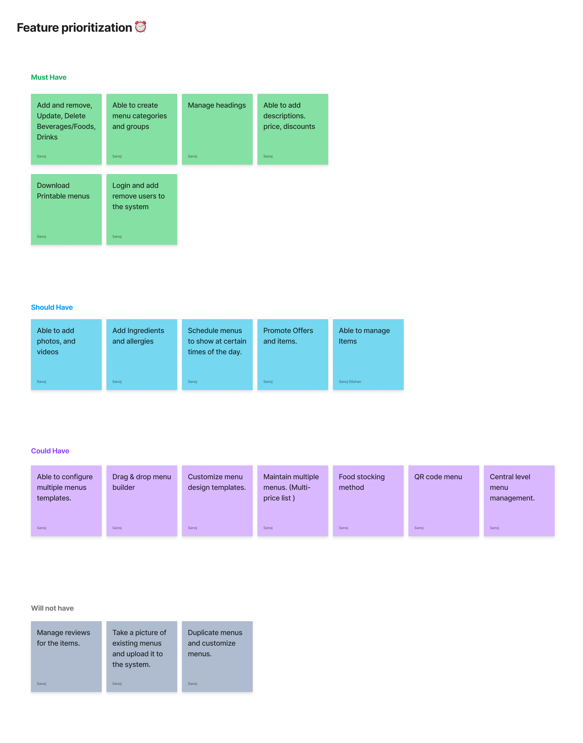
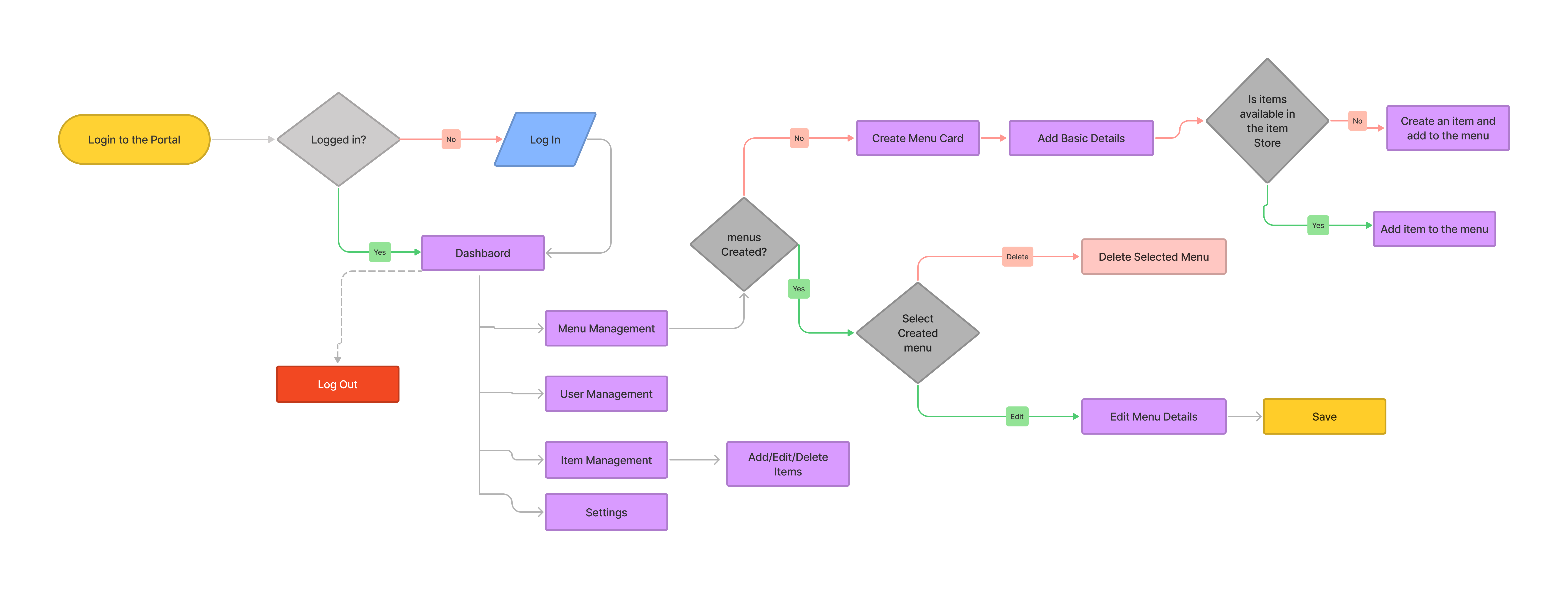
Due to time and resource constraints, I skipped the research processes. I started by identifying hypothetical features and grouping them using feature prioritization techniques and created a user flow to identify entry points through a set of steps toward a successful outcome.
User Flow
After determining which features to prioritize and include, I created a user flow to demonstrate the overall content structure of the application as well as the flow of the main navigation, which sped up the design process.
Sketches
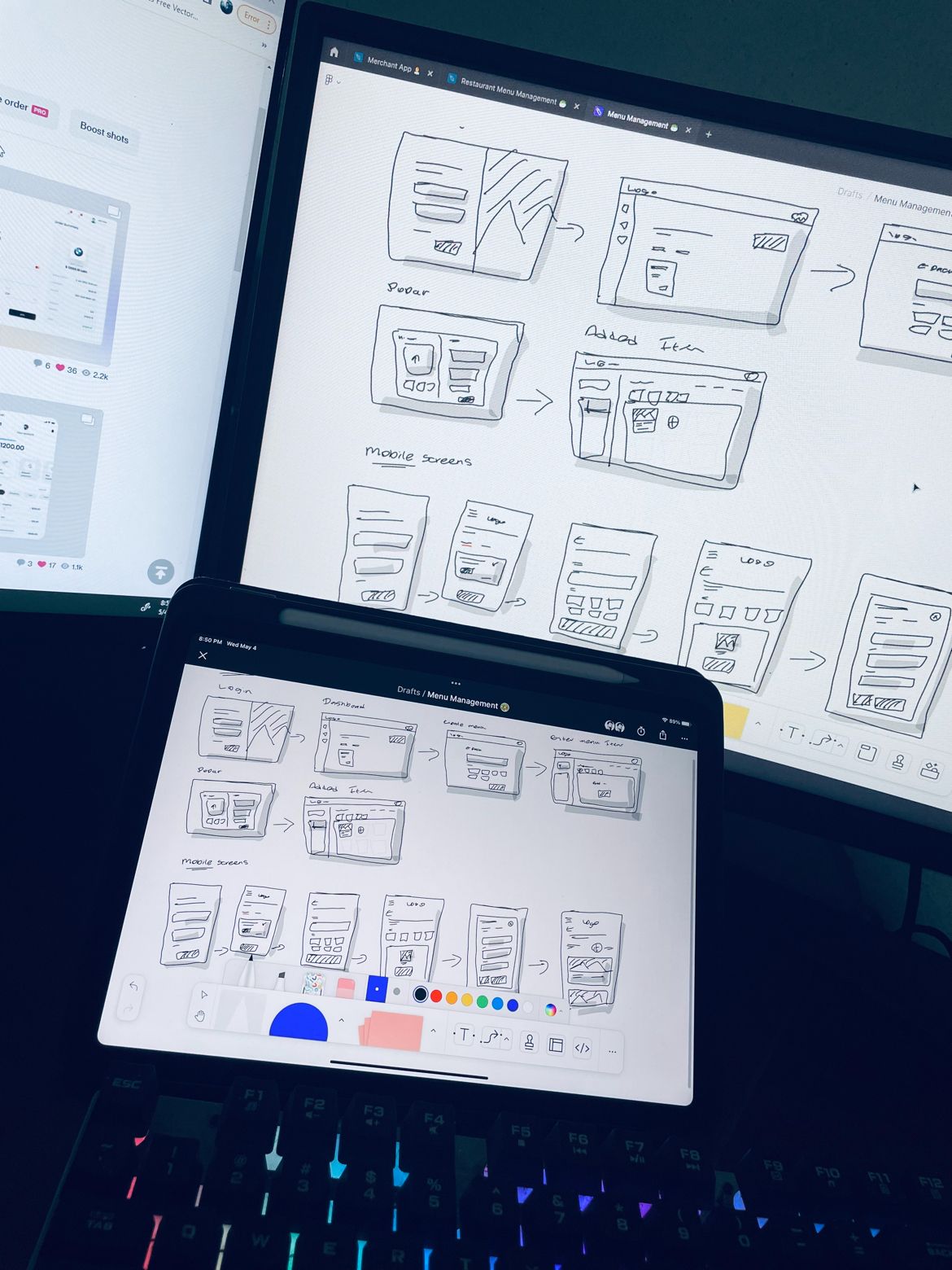
I digitally sketched out my initial thoughts and ideas based on the key features based on the research insights and created assumptions.
I used Figjam to design sketches. FigJam provides a unique space to execute ideas. It's about solving problems, generating ideas, and communicating ideas more effectively with others.
Screens
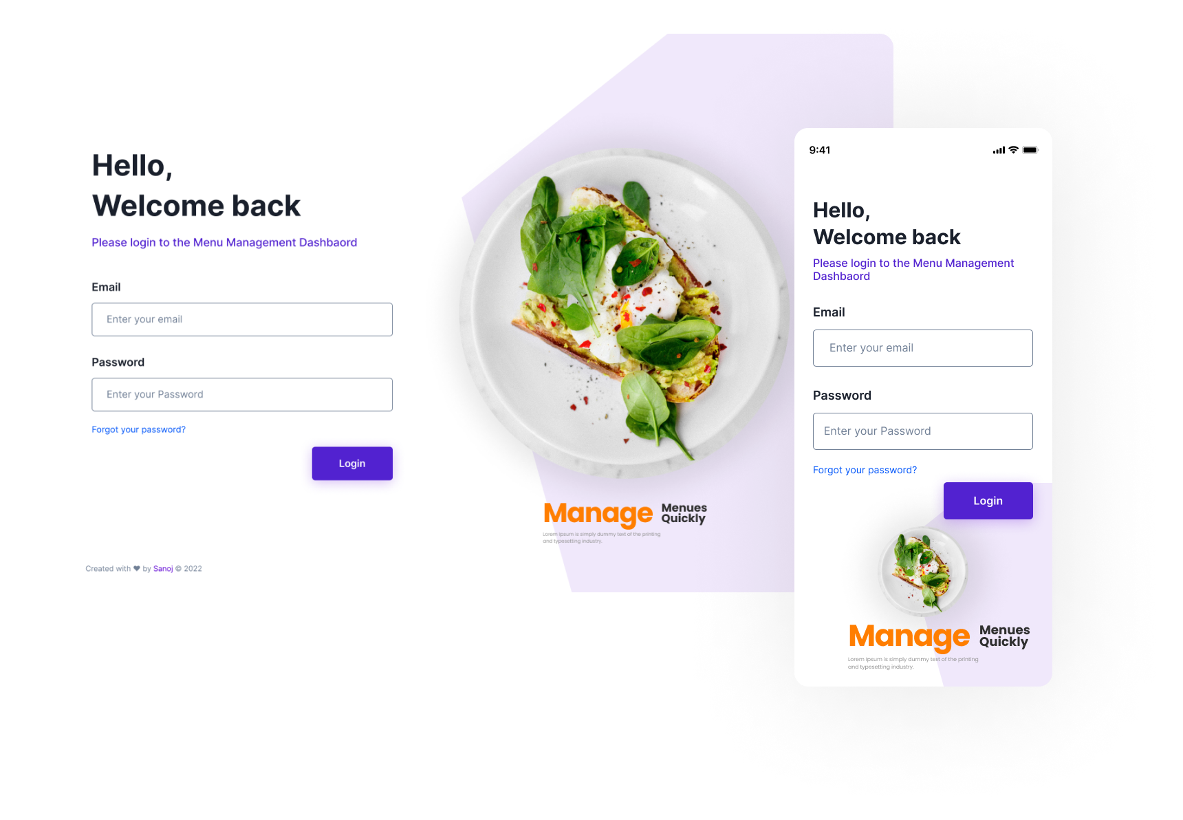
Apart from the web portal web view, Interfaces mainly consist of a mobile-first approach.
- User Login screen (Desktop view and mobile view)
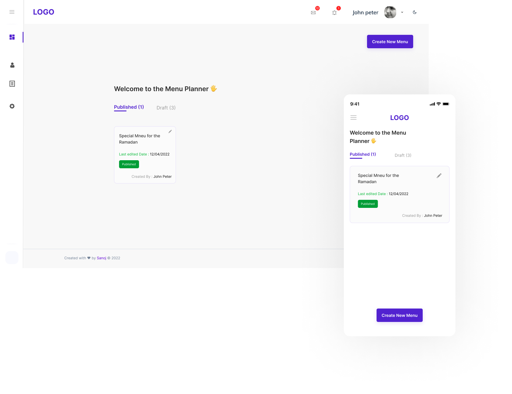
- In the dashboard, the user can create a menu, and see published menu cards and drafted ones, in the side navigation include (user management, settings, and menu card templates)
Key Features 💡
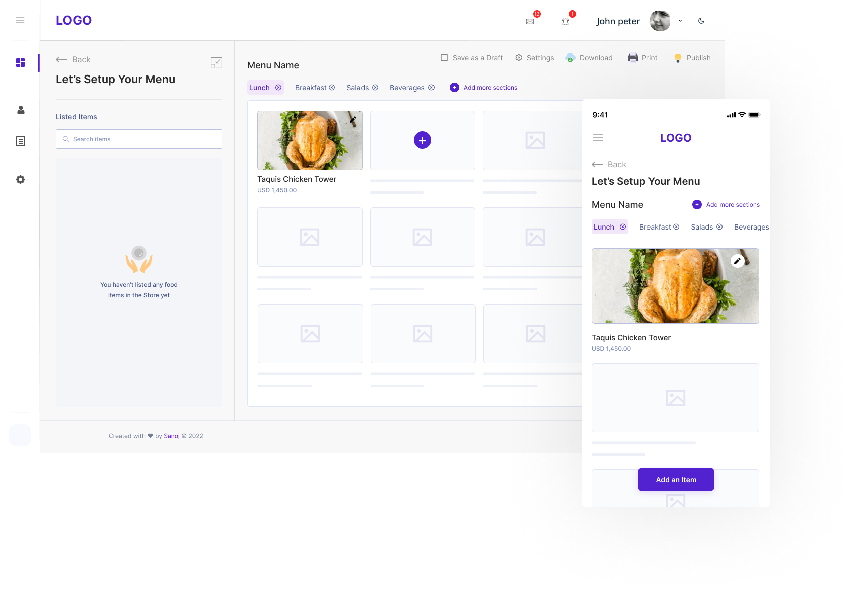
Setup menu
- In the setup menu section, the first user needs to enter a name for the menu, after that user can select the menu catalog. and proceed to the
Adding menu items screen
- In this screen, the user can add items from the list on the left side, if the user wants to create new items instead of choosing from the list, the user can click on the Add item button.
Adding menu items Details
- If this popup screen, the user can add Item basic details like (item name, description, tags, and images) in the mobile view user has two options (create a new item and select from the list.)
View Menu
- If the user successfully added a menu item, the user can see an added menu item with an image, and if the user wants to add a new menu item, the user can click on the plus icon next to the item.
Conclusion
Since this is a self-initiated & conceptual project, I couldn’t measure the actual impact of this product. However, Working on such concept with a time constraint was a bit of a challenging.
What can I do better?
- Research about competitors, and their approach to solve same problem.
- Extensive research with participants from different areas.
- Usability test of the prototype with target users.
Thank you for reading!
If you have any questions or you’d like to reach out, don’t hesitate to contact me on Linkedin, Behance, Instagram,
or email- ([email protected])